How Mobile UX Changed Digital Marketing in 2016
A year-in-review look at how mobile user experience reshaped marketing priorities in 2016, from Google's mobile-first indexing plans to AMP.
By 2016, the debate over whether to prioritize mobile was already settled; the debate that mattered now was how good the mobile experience needed to be. Mobile-friendly, the bar Google set the year before, had become table stakes. The businesses pulling ahead in 2016 were the ones treating mobile UX as a genuine discipline rather than a checkbox. Here’s what shifted over the year.
Google signaled mobile-first indexing was coming
In late 2016, Google began publicly discussing plans to primarily use the mobile version of a site’s content for indexing and ranking, even for searches happening on desktop, a concept distinct from the mobile-friendliness ranking factor introduced in 2015. This was a bigger structural shift than it sounded: it meant a site’s mobile version could no longer be treated as a stripped-down, secondary experience relative to desktop. Sites that had built thin mobile versions missing content or features present on desktop suddenly had a real reason to reconsider that approach.
AMP moved from announcement to real adoption
Google’s Accelerated Mobile Pages project, announced in late 2015, saw meaningful publisher adoption through 2016. AMP pages, built on a stripped-down HTML framework designed to load near-instantly, started appearing in a dedicated carousel in mobile search results for news content. For publishers competing for mobile search visibility, especially news and content sites, AMP adoption became a real decision point during the year, not just a future consideration.
Thumb-driven design became the norm, not the exception
As phone screen sizes grew (2016 saw wider adoption of larger-screen phones), the ergonomics of one-handed thumb use became a more explicit design consideration. Navigation patterns shifted to put frequently used actions within easy thumb reach, typically toward the bottom third of the screen, rather than clustering everything at the top the way desktop-inherited layouts often did.
Load time expectations kept tightening
Mobile users’ patience for slow-loading pages kept shrinking as they got used to faster experiences from major apps and AMP content. Pages that had been considered “fast enough” a year or two earlier started to feel sluggish by comparison, and bounce rate data increasingly showed steep drop-offs for pages that took several seconds to become interactive on a mobile connection.
Forms and checkout got another round of simplification
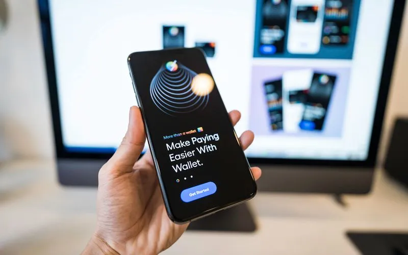
Mobile checkout abandonment remained a persistent problem through 2016, and more businesses started addressing it directly: autofill support, fewer required fields and mobile-optimized payment options (including the wider rollout of mobile wallet payment methods) all saw increased adoption as businesses tried to close the gap between mobile traffic volume and mobile conversion rate, which for many sites still lagged well behind desktop.
What this meant for marketing teams
The practical effect of all this was that mobile UX stopped being purely a design and engineering concern and became something marketing teams had to actively track. A campaign driving strong mobile traffic to a page with poor mobile UX was effectively wasting a portion of its budget, since visitors were leaving before converting regardless of how well-targeted the traffic was. Marketing and product teams that started collaborating more closely on mobile page performance, rather than treating it as someone else’s problem, saw the clearest gains.
Looking toward what came next
The direction was clear by the end of 2016: Google’s mobile-first indexing plans meant the mobile experience was becoming the primary experience in the eyes of search engines, not a secondary one. Businesses that had spent 2015 and 2016 building good mobile experiences, rather than the minimum required to pass a mobile-friendly test, were positioned well for what mobile-first indexing would formalize in the following years.