A Practical Guide to Mobile-First Design
Mobile-first isn't a breakpoint, it's designing for the smallest screen before the largest one, and why it produces leaner sites than the reverse order.
“Mobile-first” gets used loosely enough now that it’s worth being precise about what it means. It’s a design order, not a synonym for responsive. Responsive design describes a layout that adapts across screen sizes. Mobile-first describes which direction you design in: starting from the smallest, most constrained screen and progressively adding capability for larger ones, rather than designing the full desktop experience first and stripping it down for mobile afterward. Luke Wroblewski popularized the term with his 2011 book of the same name, and by this year, with smartphone ownership climbing past the majority of the population and mobile traffic share rising across nearly every sector, the case for working this way instead of just talking about it has gotten a lot harder to ignore.
Why the order matters
Designing desktop first and shrinking down afterward, often called graceful degradation, tends to produce mobile experiences that feel like leftovers: whatever survived the cut, rather than what was chosen for a small screen. Designing mobile first forces the opposite discipline. With only a few hundred pixels of width and a visitor who’s probably on the move, distracted or on a slower connection, you’re forced to decide immediately what’s essential and what isn’t. Everything that makes the cut for the smallest screen earns its place through genuine necessity, not habit.
What changes about the process
Content and navigation decisions happen earlier and get harder, not later and easier. Instead of building a full-featured desktop navigation menu and then figuring out how to compress it for mobile, mobile-first starts by asking what the two or three things a mobile visitor most needs to do are, and builds navigation around exactly that. Larger screens then get to add secondary options and richer navigation as space allows, rather than mobile inheriting whatever didn’t get cut from a desktop-first plan.
The performance benefit that comes along for free
Starting from a lean, essentials-only base and adding capability for larger screens tends to produce faster sites than starting heavy and trying to trim later, because the smallest version was never bloated in the first place. A site built mobile-first doesn’t need a separate performance-optimization pass for mobile, because the mobile version was the baseline the whole design was built from, not an afterthought stripped down from something heavier.
Where teams still get this wrong
The most common shortcut is designing the full desktop site first out of habit, then treating “make it responsive” as a separate, later step handled by whoever’s doing the CSS. That produces a responsive layout, technically, but not a mobile-first one, and it usually shows: navigation that’s clearly a compressed version of something bigger, content that wasn’t prioritized so much as squeezed and a mobile experience that still feels secondary even though it displays correctly.
The practical starting point
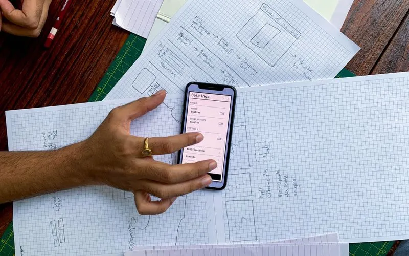
Start every new page or feature by sketching it at phone width first, before opening a desktop mockup at all. Decide what’s essential at that size, ship that decision and only then ask what a larger screen can afford to add. It’s a small change in order that produces a different, and usually better, result than designing the other way around.
More on Marketing Strategy, or browse everything from 2014.