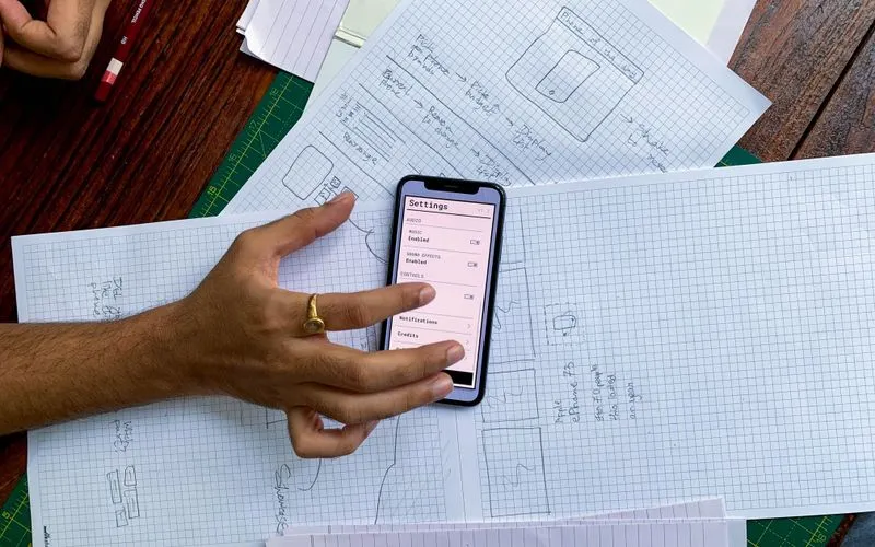
A Practical Guide to Mobile-First Design
Mobile-first isn't a breakpoint, it's designing for the smallest screen before the largest one, and why it produces leaner sites than the reverse order.
Topic
Mobile-first isn't a breakpoint, it's designing for the smallest screen before the largest one, and why it produces leaner sites than the reverse order.
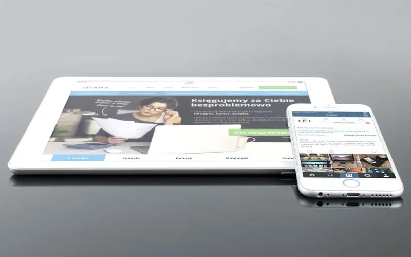
A look back at 2014, the year mobile traffic overtook desktop for many sites and marketers had to rethink design from the smallest screen up.