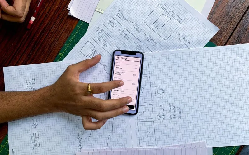
How Mobile-First Design Changed Digital Marketing in 2014
A look back at 2014, the year mobile traffic overtook desktop for many sites and marketers had to rethink design from the smallest screen up.
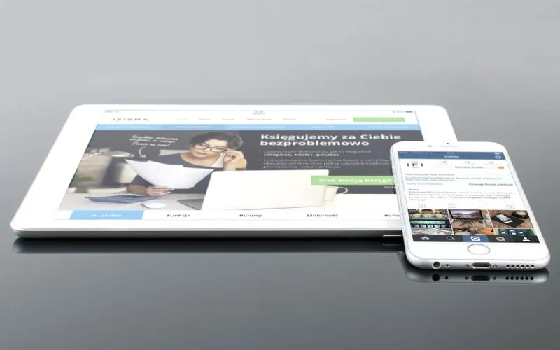
2014 was the year a lot of marketing teams stopped treating the mobile version of their site as an afterthought. Comscore reported that mobile internet usage had crossed over desktop usage in the United States, and for many retail and media sites, phone traffic was already the majority of visits. The design conversation flipped: instead of building for a desktop screen and then squeezing that layout onto a phone, teams started designing for the phone first and expanding up to larger screens from there.
Why the shift happened when it did
Responsive design had been around since Ethan Marcotte’s 2010 article coined the term, but for the first few years it was mostly a technical curiosity, something agencies pitched as future-proofing. By 2014 it was a business necessity. Smartphone penetration in the US had passed 60%, LTE networks were fast enough to make mobile browsing tolerable and app-like expectations (fast taps, thumb-friendly buttons, minimal typing) had trained users to abandon anything clunky within seconds.
The practical trigger for a lot of companies was analytics. Marketers pulled up Google Analytics, looked at bounce rates segmented by device and found mobile visitors leaving at two or three times the rate of desktop visitors on the same pages. That gap was hard to ignore once it was visible.
What changed in practice
Mobile-first design meant real constraints on what could ship, not just a stylesheet tweak:
- Navigation got simplified. Sprawling desktop mega-menus collapsed into hamburger icons and single-column stacks, forcing teams to decide what mattered on a page.
- Copy got tighter. Long paragraphs that scrolled fine on desktop demanded editing when every line ate more vertical space on a 4-inch screen.
- Forms got shorter. Checkout and lead-gen forms that asked for ten fields on desktop got trimmed, because typing on glass is slow and every extra field cost conversions.
- Load time became a design decision, not just a dev concern. Large hero images and autoplay video, common on desktop homepages, got reconsidered because they were the first thing to make a mobile page feel sluggish on cellular data.
- Click targets grew. Tiny text links that worked fine with a mouse cursor were redesigned as larger tappable buttons sized for a fingertip.
The marketing consequences
This wasn’t just a design team problem. Email campaigns needed templates that rendered on phone screens, since a growing share of opens were happening on mobile mail clients. Paid search landing pages that hadn’t been rebuilt mobile-first were quietly costing money: a Google ad could win the click and still lose the conversion if the landing page underneath it was unusable on a phone.
Agencies and in-house teams that got ahead of this in 2014 tended to do it in stages: audit which pages carried the most mobile traffic, rebuild those first, then work outward. Trying to redesign an entire site’s information architecture at once, top to bottom, tended to stall out; the sites that shipped visible improvements fastest picked a handful of high-traffic templates and fixed those.
Where this was heading
By the end of 2014 it was clear this wasn’t a passing trend. Google had already signaled that mobile-friendliness would eventually factor into search rankings, and the writing was on the wall for sites that treated mobile as a lesser experience. Teams that invested in mobile-first design in 2014, even imperfectly, were the ones with a head start when that signal became a hard ranking factor the following spring.
The lesson from 2014 wasn’t about screen sizes. It was that a growing majority of the audience was showing up on a device most sites hadn’t been built for, and closing that gap took genuine editorial and design discipline, not a plugin.